UI|UX Plan APP
visual design| UX | | UI | Figma
Welcome to our Student Registration App project! Join us on this exciting journey as we develop an innovative web application tailored to make the student registration process a breeze. We're committed to transforming our initial ideas into a sleek, user-friendly platform, ensuring a seamless and enjoyable experience for all users.

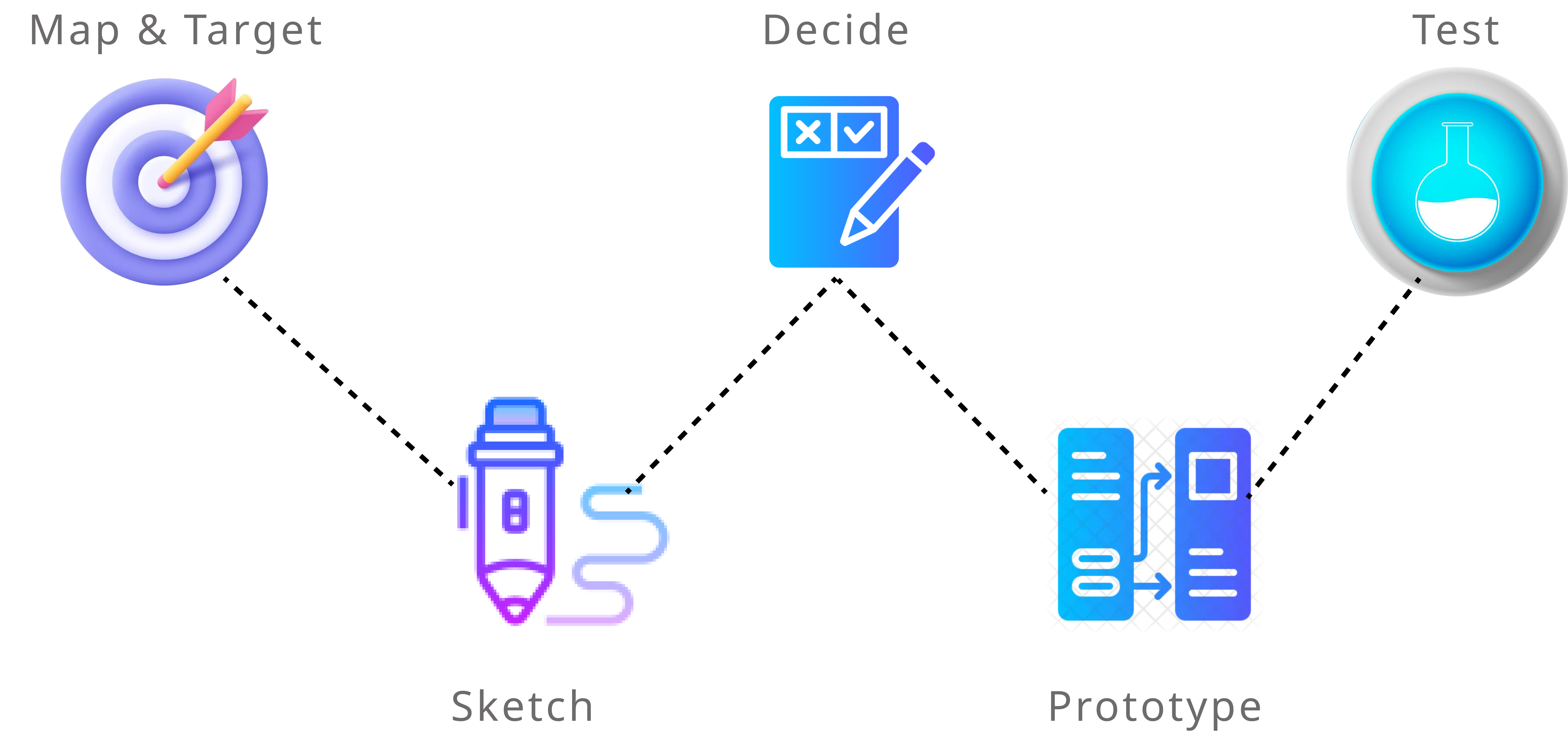
- Description
- Tech plan
- UI|UX plan
- Challenges & Feedbacks
Description
Site Map | Wireframes | Moodboard | Mockup
Integrating Vision with Functionality: In developing Our Student Registration App, we start with a site map to establish intuitive user navigation. Through wireframes, we outline the app's basic structure, ensuring simplicity and usability. A moodboard then guides us in creating a visually appealing identity, which we bring to life with detailed mockups. This comprehensive approach guarantees a seamless, engaging, and efficient registration experience for students.
tech plan
db schema | php pseudocode | js pseudocode | file structure
Our Student Registration App, with its user-friendly interface, streamlines the registration process backed by a secure PHP and MySQLi database. It incorporates a well-structured DB schema, efficient PHP pseudocode for backend operations, and JS pseudocode for frontend dynamics, all organized within a clear file structure. This design ensures a seamless, interactive experience for students, enhanced by the Fetch API and JSON for fluid data communication.
UI|UX Plan
Similer app ui|ux analyse
Conduct a thorough evaluation of the similar application's user interface and experience, identifying strengths, weaknesses, and areas for improvement.
Strengths
- Intuitive Navigation: User-friendly navigation for easy information retrieval.
- Clear Information Hierarchy: Well-organized content with a clear structure.
- Engaging Visual Design: Visually appealing with suitable color schemes.
- Consistent Branding Elements: Maintains consistent branding throughout.
Weaknesses
- Complex Registration Process: Registration process needs simplification.
- Information Overload: Some pages may suffer from information overload, requiring better information hierarchy to alleviate cognitive load for users.
- Lack of Personalization Options: Missing personalization features for user customization.

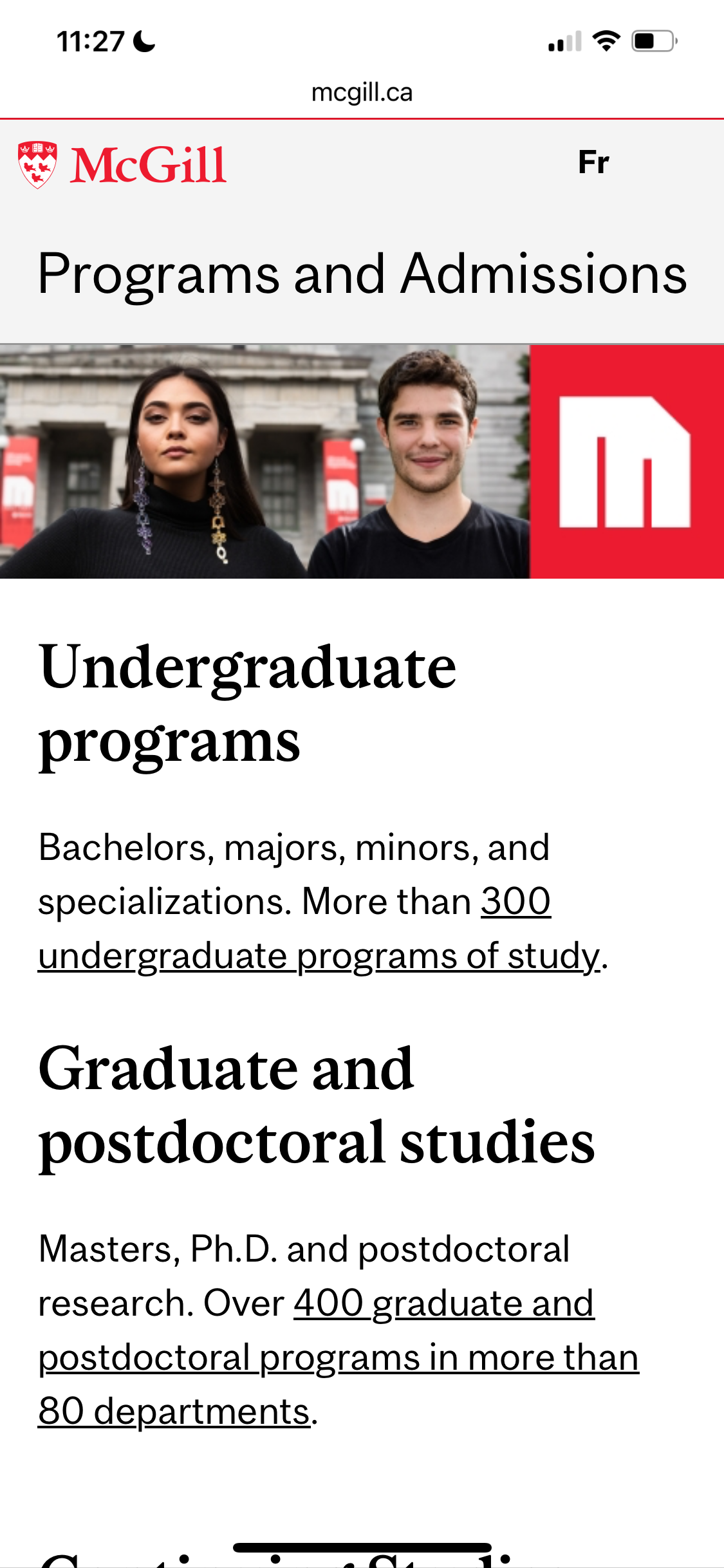
Strengths
- Exceptional User Experience Design: The app/site provides an exceptional user experience design, ensuring an intuitive and user-friendly interface.
- Comprehensive Information Coverage: Offers comprehensive information, including courses, campus activities, and academic resources, catering to diverse user needs.
- Cross-Platform Compatibility: Performs excellently across different devices and platforms, displaying strong adaptability for seamless access in any environment.
Weaknesses
- Unstable Loading Times: Some pages may experience unstable loading times, necessitating optimization to improve overall performance.
- Information Overload: Some pages may suffer from information overload, requiring better information hierarchy to alleviate cognitive load for users.
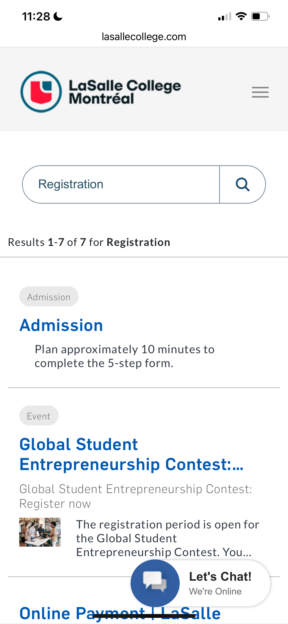
Strengths
- Simplified Navigation Structure: -The app/site features a simplified and user-friendly navigation structure, making it easy for users to locate information with minimal effort.
- Visually Appealing Design: Boasts a visually appealing design with a harmonious color scheme and well-chosen imagery, contributing to an aesthetically pleasing interface.
- Efficient Task Completion: Streamlines task completion processes, allowing users to accomplish goals with minimal steps and ensuring a hassle-free interaction.
Weaknesses
- Performance Optimization Needed: Some pages may experience slow loading times. Optimizing performance can improve the overall responsiveness of the app/site.
- Complex Registration Process: The registration process is complex and may deter new users. Simplifying the process would contribute to a smoother onboarding experience.
User personas
Choosing the right specialization in web development can be challenging for students, leading to potential mismatches between their skills and program requirements. Existing platforms may lack user-friendly interfaces, making it difficult for students to access relevant class information.



Interact prototype
Streamlined web dev programs. Pick, register, and access class info effortlessly. The coding journey simplified.
Figma Version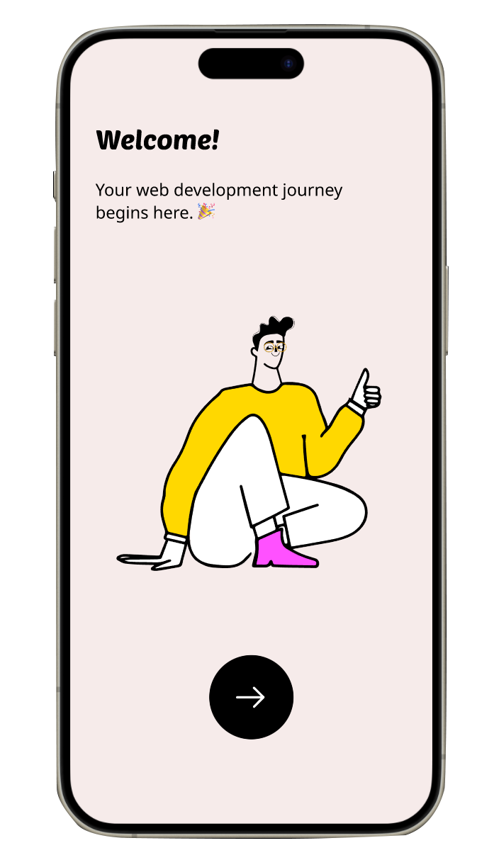
Our Student Registration App | Usability Testing Report
Objective: The Student Registration App is designed to revolutionize the way students enroll for courses. Our goal was to create an intuitive, efficient, and seamless registration experience. Background: Recognizing the challenges in traditional student registration systems, we aimed to simplify the process, reducing time and complexity. Technology Plan: Building the Framework.
Stack Overview: Utilized a combination of PHP, MySQLi, and JavaScript, supplemented by the Fetch API for dynamic data handling. Database Schema: Our robust database was meticulously structured to handle student data securely and efficiently. Backend Development: PHP and MySQLi powered our backend, ensuring reliable data processing and storage. Frontend Interactivity: JavaScript and the Fetch API were key in creating a responsive and interactive user interface. UI/UX Plan: Designing the Experience.
Philosophy: We focused on a user-centered design, prioritizing ease of navigation and minimalistic aesthetics. User Journey: The app guides students through a clear, step-by-step registration process, enhancing user satisfaction. Visual Elements: Chose a soothing color palette and intuitive icons to create a welcoming and straightforward interface. Project Accoutrements.
Problem: Addressing the inefficiency and complexity of traditional student registration processes. Solution: Developed a streamlined app that simplifies and speeds up course enrollment. Key Takeaways: Achieved a user-friendly platform that minimizes registration time and maximizes usability. Feedback and Reflections.
Feedback: Received positive feedback on the app’s ease of use and interface design. Suggestions for future updates include more personalized course recommendations. Personal Reflection: This project highlighted the importance of user feedback in creating effective digital solutions. Conclusion.
Student Registration App successfully demonstrates how technology can transform educational processes, making them more accessible and user-friendly. It stands as a testament to the power of thoughtful design and strategic development in solving real-world challenges.
See Student Registration App